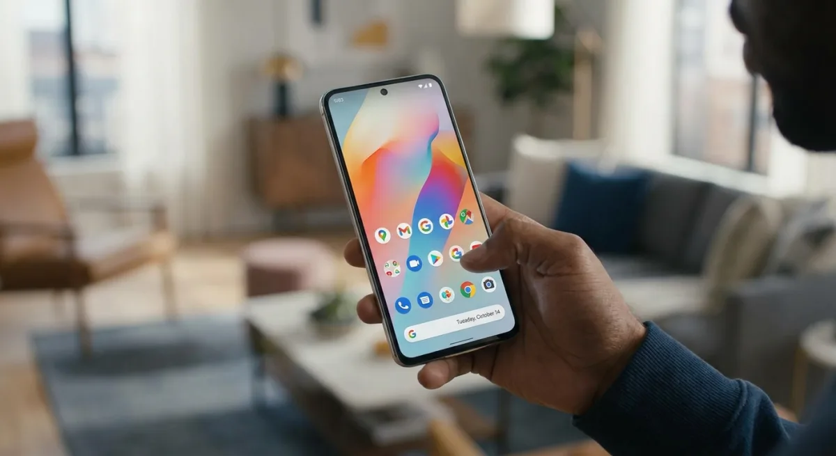
For years, Android users have struggled with cluttered home screens where text labels clash with complex wallpapers, but the ability to hide app names in Android 17 finally solves this visual mess. This seemingly minor UI tweak transforms how you customize your Google Pixel, allowing for intricate backgrounds without sacrificing usability. By removing the text beneath the icons, the home screen immediately adopts a cleaner, minimalist aesthetic that prevents text from blending unreadably into black-and-white or highly detailed wallpapers.
While developers spend significant time designing recognizable icons, the text label has long been a redundant feature for daily drivers. Hiding these names does not impact navigation for most users, as muscle memory and distinct icon designs are usually enough to identify an app. Importantly, this change only applies to the home screen. The app drawer remains an alphabetically sorted repository complete with text labels, ensuring that less frequently used apps are never truly lost.
How to Remove App Names on Google Pixel
Currently exclusive to Google Pixel devices running the Android 17 update, this feature is buried within the system's customization settings. Follow these steps to declutter your home screen:
- Tap and hold on an empty space on your home screen.
- Tap Wallpaper & style from the pop-up window.
- Scroll down and tap Icons.
- Tap Names.
- Turn off the Show app names toggle.
- Tap Apply in the upper-right corner of your screen.
Once applied, the text will vanish from your home screen immediately, leaving only the icons floating cleanly over your chosen wallpaper.
The Themed Icons Dilemma
While hiding app names works flawlessly with standard icons, it creates a significant usability hurdle when combined with monocolor app theming. Introduced in 2025 and recently expanded with AI-generated themes, this feature applies a uniform color palette to all supported icons. When you remove the text labels from uniformly colored icons, identifying apps at a glance becomes incredibly difficult.
Without their distinct brand colors, apps with similar geometric shapes become nearly indistinguishable. For example, productivity apps like HelloHabit and Structured look identical without their inverse color schemes, while Gmail and Musixmatch share confusingly similar silhouettes. Even the newer AI-generated themes that retain some color can cause visual confusion. This combination is only recommended for users who keep a very sparse home screen and rarely rearrange their layouts.
Other Notable Android 17 Upgrades
Beyond home screen aesthetics, Android 17 introduces several practical enhancements aimed at productivity and multitasking. These features elevate the operating system beyond a simple iterative update:
- Enhanced Split-Screen: A new 90:10 ratio split allows users to seamlessly jump back and forth between apps on the same screen without hiding critical interface elements.
- App Bubbles: Highly effective on standard phones and exceptional on foldables and tablets, these floating bubbles allow users to store productivity and organization apps for quick access without opening the app carousel.
- Advanced Camera Access: Third-party apps can now tap into the most powerful, native features of the phone's camera hardware.
- Separated Volume Controls: The Google Assistant volume is now entirely separate from standard media volume.
- Granular Contact Privacy: Users can now restrict apps to access only specific, permitted contacts rather than the entire address book.
The Shift Toward Spatial Navigation
The ability to hide app names in Android 17 highlights a broader shift in how Google expects us to interact with our devices. We are moving away from text-based navigation toward spatial and visual memory. However, Google is currently offering customization tools that actively fight each other. You can have a minimalist, text-free home screen, or you can have a uniformly themed, AI-generated icon layout - but combining the two breaks the user experience entirely.
This friction suggests that while Android 17 delivers some of the most substantial productivity upgrades in years - like the brilliant 90:10 split-screen and granular contact privacy - its aesthetic customization is still a fragmented work in progress. For now, users must choose between the clean look of hidden text or the cohesive palette of themed icons, as the OS has not yet found a way to successfully marry the two.