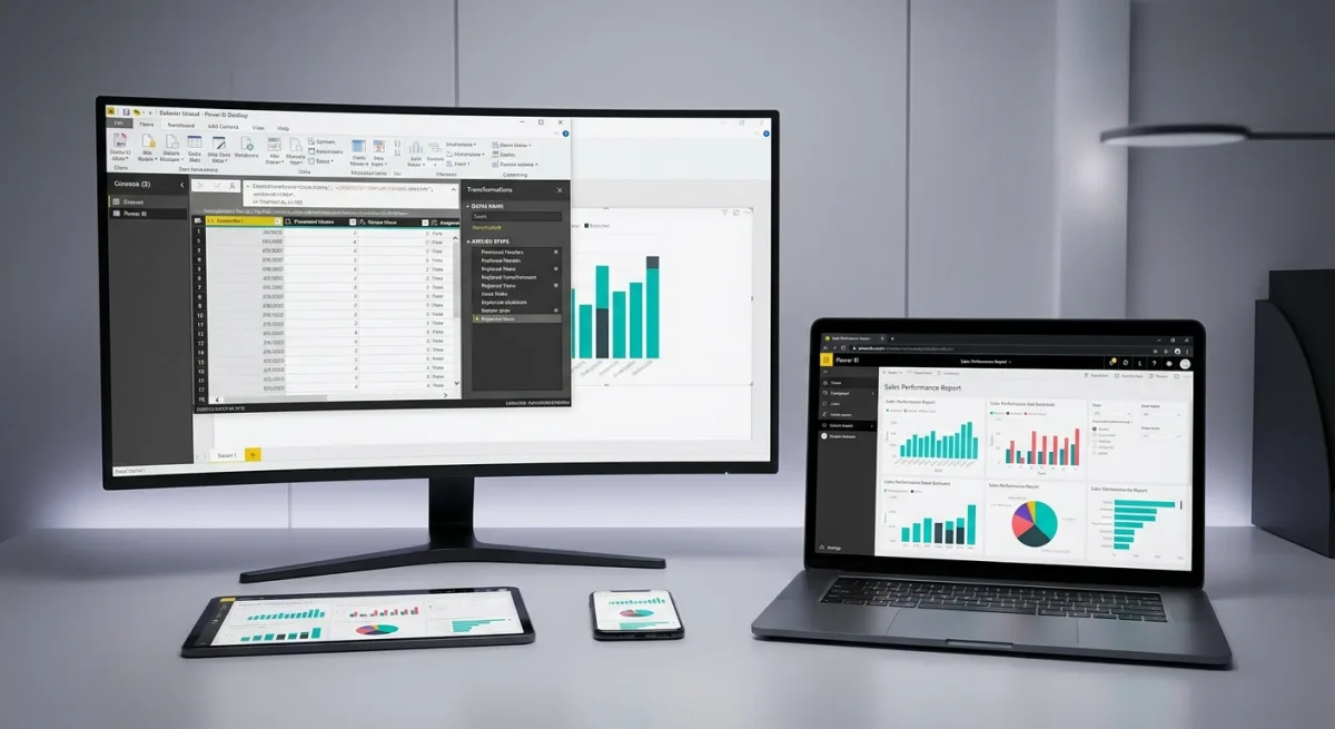
Spreadsheets are excellent for storing raw data, but they fail miserably when you need real-time, interactive insights. If you are tired of manually updating charts or struggling to track key performance indicators across messy CSV files, Microsoft's business intelligence platform is the solution. This comprehensive guide walks you through transforming raw, unstructured data into a fully interactive, cloud-hosted dashboard using Power BI.
You will learn the complete professional workflow: loading data, cleaning it, building a proper data model, creating visuals, and publishing the final report to the cloud. By the end of this tutorial, you will have a functional dashboard that can be viewed and interacted with on both desktop and mobile devices.
Understanding the Practice Semantic Model
Before building visuals, you must understand the underlying data. For this workflow, imagine a fictional sales semantic model containing about 500 rows of transactions. Real-world data is rarely perfect, so this dataset intentionally includes messy elements.
Common issues include abbreviated region names (like "N" instead of "North"), missing customer names, and inconsistently formatted dates. Identifying these anomalies early is crucial, as you will need to fix all of them during the data transformation phase to ensure accurate reporting.
Part 1: Loading Data into Power BI Desktop
Power BI Desktop is the free Windows application where the core development happens. This is where data gets loaded, cleaned, modeled, and turned into visual reports.
- Download the software: Get Power BI Desktop from Microsoft's official website. It requires no paid license to start building.
- Navigate the interface: Upon opening, you will see a blank canvas with three view icons on the left sidebar: Report view (for visuals), Table view (for inspecting data), and Model view (for managing relationships).
- Import the data: Click Get Data on the Home ribbon, select Text/CSV, and navigate to your saved sales data file.
- Preview and transform: Power BI will show a preview of your data in the Navigator window. This is a critical step: always click Transform Data instead of Load. Loading pushes raw, messy data straight into your model, while transforming opens the Power Query Editor so you can clean it first.
Cleaning and Transforming Data with Power Query
Power Query is the data transformation layer that sits between your raw data and your data model. Every change you make here is recorded as a step in the Applied Steps pane, meaning none of it alters your original CSV file. You can always go back, reorder steps, or delete them.
- Check the headers: Ensure your first row contains column names. If you see generic names like "Column1", go to the Home tab and click Use First Row as Headers.
- Set data types: Power Query guesses data types, but you must verify them to prevent calculation errors later. Click the icon next to each header to set OrderDate to Date, Quantity to Whole Number, and both UnitPrice and Discount to Decimal Number.
- Fix inconsistent region names: Select the Region column, go to the Home tab, and click Replace Values. Replace "N" with "North", ensuring you tick the Match entire cell content box so you do not accidentally create words like "Northorth". Repeat this for South, East, and West.
- Handle missing values: Click the dropdown arrow on the CustomerName column header. Uncheck (blank) or (null) to remove rows where the customer name is missing.
- Add a calculated column: You need a TotalSales column that accounts for quantity, price, and discount. Go to the Add Column tab, click Custom Column, and enter the following formula:
[Quantity] * [UnitPrice] * (1 - [Discount])- Finalize the column: Name the new column TotalSales, click OK, and ensure its data type is set to Decimal Number.
- Apply changes: Once satisfied with the cleaned data, click Close & Apply on the Home tab to load the transformed data into your Power BI data model.
Building a Robust Data Model
A good data model makes everything easier: your visuals work correctly, your DAX calculations stay simple, and your report performs well. Rushing past this step is the most common reason beginners struggle with Power BI.
Currently, you have a single flat table where text like "Electronics" and "South" repeats hundreds of times. This bloats the file and complicates calculations. The solution is to split this single table into a star schema, separating the transaction events from the descriptive context.
| Feature | Fact Table | Dimension Table |
|---|---|---|
| Contains | The transaction itself (what happened) | The context (who, what, where, when) |
| Rows | Many (one per order) | Few (one per unique product or region) |
| Key columns | Foreign keys pointing to dimensions | Primary key (unique identifier) |
| Data types | Numeric values to aggregate | Attributes to filter or group by |
To build this star schema, you will create dimension tables from your flat file using Power Query.
- Build the DimProduct table: Re-open Power Query. Right-click your main sales query and select Duplicate. Rename it DimProduct. Keep only the ProductCategory and ProductName columns, remove duplicates, and add an Index Column (from 1) named ProductKey.
- Build the DimRegion table: Duplicate the main query again, rename it DimRegion, keep only the Region column, remove duplicates, and add an Index Column named RegionKey.
- Create a DimDate table: Close Power Query. In Power BI Desktop, go to the Modeling tab, click New Table, and enter this DAX formula:
DimDate =
ADDCOLUMNS(
    CALENDAR(DATE(2026, 1, 1), DATE(2026, 12, 31)),
    "Year", YEAR([Date]),
    "Month", MONTH([Date]),
    "MonthName", FORMAT([Date], "MMMM"),
    "Quarter", "Q" & FORMAT([Date], "Q")
)- Mark as Date Table: Select the new DimDate table, go to Table tools, click Mark as Date Table, and choose the Date column.
- Connect the foreign keys: Return to Power Query. Use Merge Queries on your main sales table to bring in the ProductKey from DimProduct and the RegionKey from DimRegion. Expand only the key columns and uncheck the original column name prefix. Click Close & Apply.
- Create relationships: Switch to Model view. Drag ProductKey from the sales table to ProductKey in DimProduct. Repeat for RegionKey, and connect OrderDate to Date in DimDate. Ensure all relationships are active, one-to-many, and single-direction.
Creating Visuals: Charts, Tables, and KPIs
Switch back to Report view. This is where your data model becomes an interactive dashboard. You will use the Visualizations pane to select chart types and the Data pane to drag fields into the appropriate axis or value wells.
First, you need to create DAX measures. Unlike a calculated column that stores data in every row, a measure calculates in real-time based on active filters. Right-click your sales table, select New Measure, and create these three calculations:
Total Sales = SUM(sales_data[TotalSales])Total Orders = COUNTROWS(sales_data)Avg Order Value = DIVIDE([Total Sales], [Total Orders])Using DIVIDE is safer than the standard slash operator because it returns a blank instead of an error when dividing by zero, preventing broken visuals.
- KPI Cards: Add three Card visuals to your canvas. Drag Total Sales, Total Orders, and Avg Order Value into each respective card to display high-level summaries.
- Line Chart: Select the Line Chart visual. Drag Date to the X-axis and Total Sales to the Y-axis to show monthly sales trends.
- Bar Chart: Select the Clustered Bar Chart. Drag Region to the Y-axis and Total Sales to the X-axis to compare regional performance.
- Matrix: Add a Matrix visual. Place ProductCategory in Rows, and add your three measures to Values. Apply conditional formatting (Data bars) to the Total Sales column for quick visual comparisons.
- Slicers: Add two Slicer visuals. Populate one with Date (creating a slider) and the other with Region (creating checkboxes). Selecting a region will now dynamically cross-filter every visual on the page.
Part 2: Publishing to Power BI Service
Power BI Desktop is where you build; Power BI Service is where you share and collaborate. It is a browser-based platform where published reports live in the cloud.
- Publish the report: Click Publish on the Home ribbon in Desktop. Sign in with your Microsoft account and select My Workspace as the destination.
- Create a Dashboard: In Power BI Service, a report and a dashboard are different. A report is multi-page and interactive, while a dashboard is a single-page collection of pinned tiles. Hover over your KPI cards and charts in the report, click the pin icon, and send them to a new dashboard for quick monitoring.
- Configure Scheduled Refresh: To keep data current, click the three dots next to your semantic model in the workspace and select Scheduled Refresh. If your data is on-premises, you will need to install a data gateway to bridge your local network and the cloud.
Part 3: Power BI Mobile App Integration
Once published to the cloud, your insights are accessible anywhere. Download the Power BI app for iOS or Android and sign in.
Dashboards work exceptionally well on mobile because they are designed as single-screen overviews. You can also set Data Alerts on KPI tiles. For example, you can configure an alert to notify your phone if Total Sales drops below a specific threshold.
For a better mobile experience, return to Power BI Desktop, go to View, and select Mobile Layout. Here, you can drag and resize visuals onto a phone-shaped canvas, ensuring your team gets a perfectly optimized view on smaller screens. To validate your skills further, consider pursuing the PL-300 Microsoft Power BI Data Analyst certification.
The Hidden Engine Behind Every Great Dashboard
Most beginners rush straight to the visual charts, assuming the drag-and-drop interface is the core of Power BI. However, the true power of this platform lies entirely in the data modeling phase. By structuring data into a star schema rather than relying on a single flat table, you drastically reduce file bloat and ensure DAX measures calculate instantly, even across millions of rows.
This architectural discipline is what separates amateur spreadsheets from enterprise-grade business intelligence. As organizations increasingly adopt the broader Microsoft Fabric ecosystem, mastering these foundational modeling principles ensures your dashboards remain scalable. Without a proper star schema, your reports are just pretty pictures that will inevitably break or slow to a crawl under heavy data loads.